A few weeks ago I attended Microsoft’s BUILD conference to get ready for what’s coming in Windows 8. As I was sitting in the first day’s keynotes and big picture sessions, I couldn’t help but think back on the work HP has done with its TouchSmart software and notice areas where the TouchSmart software pioneered ideas that Microsoft is now building into Windows 8 for the new Metro style of programming and the new touch-first Start screen. I decided to dig a little deeper and give you a brief tour of the history of TouchSmart and highlight some of the ideas now in Windows 8 that we put into the TouchSmart software a long time ago. I’ll put a [+Win8] marker by the ideas as I go along. Let’s get started!
TouchSmart 1, aka SmartCenter, aka LaunchPad (January 2007)
The first version of TouchSmart was not called that. It was named SmartCenter and shipped with the very first modern all-in-one touch-enabled PC, the HP TouchSmart IQ770.
              Â
This machine was one of the so-called “Dream PCs†for Microsoft’s introduction of Windows Vista in January of 2007. I’ve written about this version of SmartCenter before, so I won’t repeat much of that here.
Touch-first [+Win8]
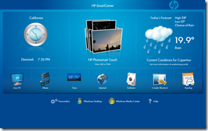
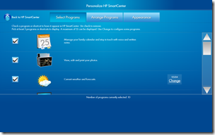
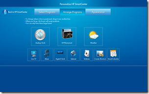
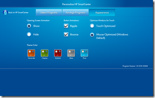
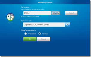
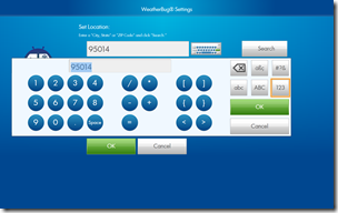
Of course, the main point of even embarking on a project such as the SmartCenter software was that Windows wasn’t even remotely ready for touch interactions. Every app on the Windows Desktop requires the precision that the mouse pointer provides. Fingers and touch can’t hit the tiny controls accurately enough. So SmartCenter was designed with that in mind, and as a result had large targets all throughout its user interface. Here are some sample screenshots:
Note that all buttons, checkboxes, radio buttons, scrollbars, etc. are large enough to be easily tapped with a finger. Note also that, for example, the on-screen keyboard that is used for entering a ZIP code in the Weather app defaults to the correct layout, i.e. the numeric one.
Live app data in shortcuts [+Win8]
This idea wasn’t really all that new, of course. Snippets of live app data displayed in a mini-view of sorts had been introduced with Windows Sidebar gadgets and other widget-like UIs on other operating systems, but SmartCenter was the first to use live data as part of the shortcut that launches an app. You could say the shortcuts were more like mini-versions of the full app. Live data is of course hard to demo with screenshots, so here is a small video clip of the SmartCenter home screen (or start screen, if you will), showing shortcuts that update their information as time passes:
This major version of the SmartCenter software was delivered with four total releases: 1.0, 1.1, 1.2, and 1.4. Towards the final delivery of version 1.0, it became clear that a standardized way of getting the live information from the apps was needed. This became a major area of investigation and investment for the next major version of the software.
TouchSmart 2 (June 2008)
The second generation of TouchSmart software, 2.x, was introduced with IQ500/IQ800 series hardware. These two hardware models marked the beginning of the monitor-like appearance of the TouchSmart PCs. The IQ770 was a “multi-volume†chassis – these new models had a “single volume†design, supported by the “easel†style feet that were used in the follow-on generation as well.
        Â
The 2.x series of software was released in three versions: 2.0, 2.5 and 2.8.
Fixed layouts for apps [+Win8]
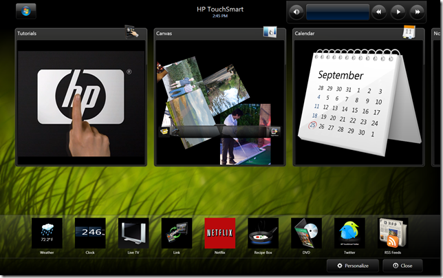
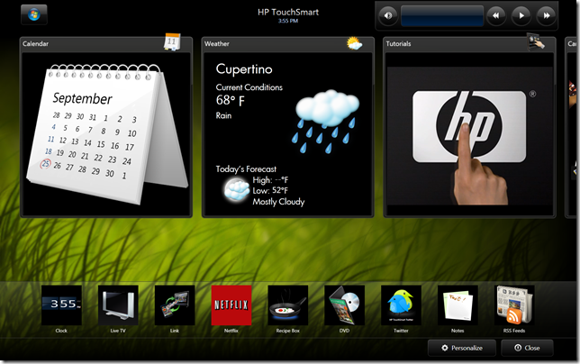
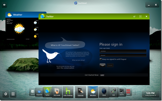
With SmartCenter 2.0, we introduced the concept of fixed sized layouts for the TouchSmart apps. We initially picked three: small, medium and large. You can see two of the three illustrated by this screenshot:
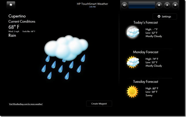
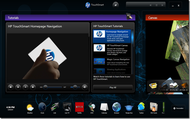
The Tutorials, Canvas and Calendar apps are shown in medium size, while the remaining apps are shown in small size. By tapping on an app, you would go to the large size:
This layout is purposely not called full screen, since there is a reserved area at the top of the screen for navigation, app name/time and music playback controls.
Tiles concept [+Win8]
In order to make it clear that the app representations in SmartCenter were not just icons, we decided to call them tiles, or rather “live tiles.†This term was used in the developer documentation that was produced to help other people plug their apps into SmartCenter, and so we had “small tiles,†“medium tiles†and “large tiles.†For each tile size we gave guidance about how to use it appropriately. We introduced the term “layouts†to suggest that each tile size should use a different layout of basically the same content or information. As you notice from the screenshots above, when the Weather tile is small, it shows only basic information. In the large tile, the information is more full-featured and also provides access to settings for the Weather app. The medium tile for Weather looks like this:
As you can see, this layout for Weather includes only the current conditions and the forecast for the day.
With TouchSmart 2.0, a big investment was made to produce media consumption applications: Music, Video and Photo (often shortened to “MVPâ€) as well as a WebCam and DVD app. The screenshot above shows other apps that were published later (Netflix and Recipe Box, for example), but that just goes to show that following development guidelines has benefits: newer apps can work with older SmartCenter versions…
Other changes from the 1.0 version include the top and bottom row of “tile scrollers†and the music playback control set (aka. “media plateâ€) that I already mentioned. The tile scrollers had two different behaviors, depending on how full they were. If enough tiles were present, the scroller would become an infinitely looping container. If not enough tiles were present, it would have “snap-to†endpoints.
The TouchSmart 2.0 software was unveiled at a big press event in Berlin, Germany. Several of my colleagues were invited to attend to make sure everything went smoothly from a technical perspective. The most nerve-wracking part was that the TouchSmart IQ500 was to come out of a pedestal on stage after sitting inside said pedestal for an extended period of time before its unveiling. People were not sure the thermals were designed to handle as little exchange of air as this posed. Here’s a video from the introduction to give you a better idea of what I’m talking about (skip towards 1:18 or so to see the pedestal and the TouchSmart lifting out of it):
As you can see, everything worked out pretty well. This was the biggest introduction ever made for a TouchSmart PC line. No event after that had that much effort put into it.
TouchSmart 3 (October 2009)
With the third generation of SmartCenter, we piggybacked onto the 600/300 series of hardware. The enclosures still used the easel stand design with three feet for support, and the exterior was tweaked a bit along with the screen aspect ratio (now 16:9 instead of 16:10).
        Â
Generally, though the concept was largely the same, except for the software. A big investment was made to produce more apps for the TouchSmart software suite, and this brought us apps like Canvas, Twitter, Hulu, Live TV, Link, Movie Store, Recipe Box and a bunch of others. The TouchSmart software development guidelines were augmented with more of a proper SDK with app samples, installer samples and more guidance.
New layout
SmartCenter 3.0 introduced another layout that we called wide-interactive. You see, in SmartCenter 2.x there was no way to interact with the medium sized tiles in the upper tile scroller (except for in the browser, but that’s a small detail). In this version we wanted to provide interaction with the app in the upper scroller. In order to do that properly we needed a bigger size tile and a new layout to have enough space for interaction to make sense. Here’s a screenshot of 3.0 (running on a 16:10 screen, not the aspect ratio it was designed for – so circular elements are “squishedâ€):
In SmartCenter 3.0 the touch scrollers no longer “looped†infinitely, but each had a “snap to†end regardless of how many tiles were present; each wide-interactive tile was given a colored title bar to add a little splash of variety and visual interest. In addition, the “media plate†and other control elements on the home screen were redesigned to appear a bit lighter than before. Also, standard button glyphs were introduced for closing and minimizing SmartCenter. Oh, and the clock was moved around and given a day of the week display. Phew – at least the Personalize button stayed almost in place…
The final big change was that tiles in the bottom scroller no longer used the small layout. They were simply icons to launch the app into large layout directly. This was done to improve performance and load less stuff at the startup of SmartCenter.
TouchSmart 4 (September 2010)
Okay, so here we are, almost at the last chapter of this brief history (which is turning out not so brief after all…) TouchSmart 4.0 was introduced with the TouchSmart 310 (and 610) series of hardware. These departed from the easel-type stand and went to a single-foot design (I know there’s a better term for it, I just can’t think of it at the moment).
        Â
TouchSmart 4 didn’t see much investment in new apps, but focused on new capabilities provided by the SmartCenter framework.
Infinite Canvas [+Win8, sort of, on the Metro Start screen]
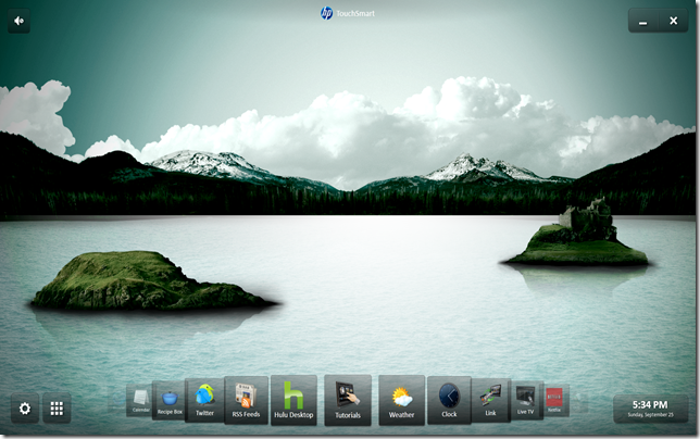
A major goal of the SmartCenter framework software had been to provide an almost limitless space for apps to live in. With SmartCenter 4.0 that goal was finally realized. Not only did the framework provide for an infinitely expanding space for hosted apps to live in, it also did away with the upper tile scroller and let the apps be positioned freely on the canvas. This is what TouchSmart 4.0 looks like after initial startup:
And once again, things were moved around on screen: The clock from lower left to lower right (and it was given a function: click to show a mini-calendar), personalize from lower right to lower left (and the word personalize removed). The “media plate†music playback controls were removed and put into the music app instead. The volume control was separated out from the media plate and put in the upper left. The bottom carousel was redesigned and had the infinite looping re-introduced (to allow for a bit of visual and interactive playfulness). Tapping a tile launches the corresponding app:
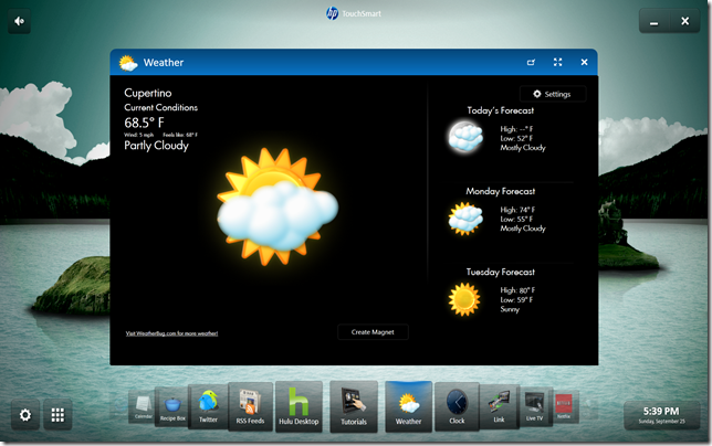
Apps can be moved around freely and the carousel shows a colored highlight for each running app:
If you look at the above shot closely, you’ll notice the Weather app in what looks like another layout. What’s happening there is not a new layout, though. It’s simply the wide-interactive layout, shrunk down to an “inactive” size. Thus we called it “shrunk layout” or “shrunk view”.
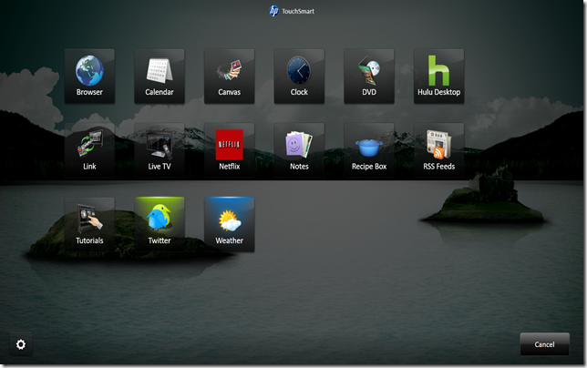
The button next to personalize in the lower left can be used if the app you’re looking for in the carousel is hard to find: QuickLaunch is sorted alphabetically:
Parallax background [+Win8, sort of, on the Metro Start screen]
Scrolling the canvas (or panning it, if you prefer) is done by grabbing empty space (with mouse or touch) and moving from side to side. To add a little visual interest to this, and to demonstrate the departure from the 3.0 tile scrollers, we added a parallax effect to the background to give you the illusion of looking into the distance on your screen. Several sets of parallax backgrounds were developed for variety’s sake, to be picked in the personalize area.
Magnets
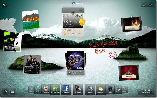
Another major feature of SmartCenter 4.0 was the introduction of something we called “magnetsâ€. These represent active content that originally came either from an app or from SmartCenter itself (in the case of Graffiti magnets). Magnets eliminate the need to start an app when you want to enjoy a favorite piece of content, be it a photo, video or some music you want to keep handy for quick enjoyment. Here are a few magnets placed on the canvas (they can be “pinned†so they always stay visible or “unpinned†to scroll with the canvas):
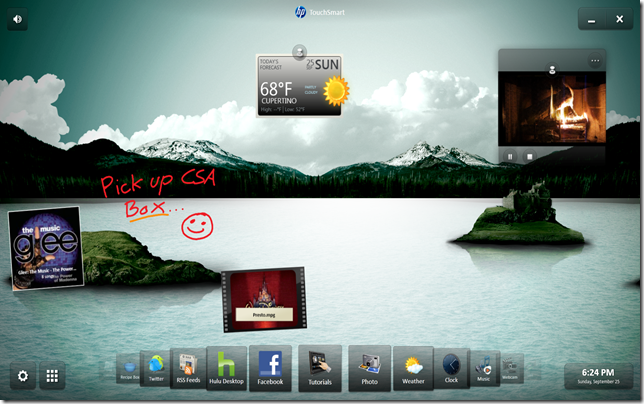
Here’s what it looks like after panning a bit (while playing the fireplace video):
You can see the pinned magnets haven’t moved and the background looks slightly different (the islands have moved at different paces to give the illusion of depth as they’re moving).
Okay, let’s see what it looks like in action:
TouchSmart 5 (September 2011)
And that brings us to the latest generation of SmartCenter (as of this date), i.e. 5.0. This version of the TouchSmart framework software was brought to market with the just recently introduced 520/420/320 series of TouchSmart PCs. The exterior of the machines has been updated once more to keep up with design trends, but otherwise the single-volume enclosure is still the chosen form.
           Â
Integration of Windows apps, desktop icons
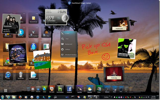
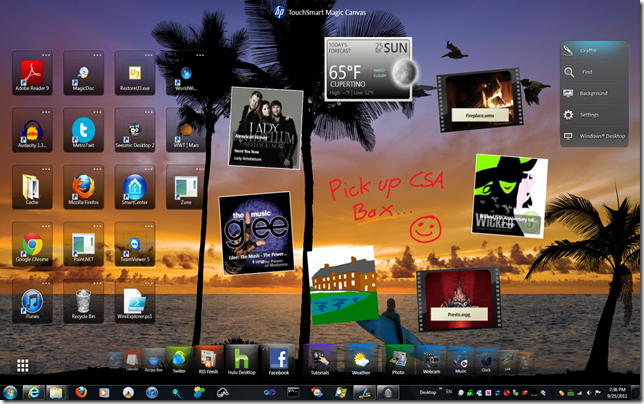
The biggest change in SmartCenter 5.0 regards the blending of the two environments that were previously separated: SmartCenter and the Windows Desktop. This means you no longer need to exit the SmartCenter environment when you want to run Windows apps. Here’s a screenshot of SmartCenter 5.0:
Note that the Windows 7 taskbar is fully visible and that you can use it for launching apps and seeing what apps are running. The SmartCenter app carousel now has the icon highlight turned on permanently and only shows a short animated starburst as an app is launched. You also see all your desktop icons represented on the SmartCenter canvas. As you can see, the magnets overlap the desktop icons, which can be a bit of a clutter issue. No worries, you can turn off the desktop icons via Settings, if you don’t like them on the canvas. Or you can rearrange your magnets so they occupy different space:
In general, SmartCenter 5.0 attempts to bring the touch-first environment of past generations together with the traditional, mouse-centric desktop. That’s a value-proposition you don’t have in Windows 8, which is most likely not available until sometime in late 2012 anyway…
Automatic panning/scrolling
One additional thing SmartCenter 5.0 does is automatic panning of the canvas/desktop whenever an app is launched. This removes the need for you to have to rearrange app windows frequently when you want to switch from one app to another. The canvas pans automatically to make more room for every app you start. To return to an app, you just click on it in the taskbar or the app carousel. Another video might explain it a bit better:
This behavior can be turned off in Settings as well, in case it’s not useful to you. There are many, many areas that I haven’t touched on in this post, such as all the personalization and customization aspects that SmartCenter contains and how they changed over time. Or the fact that you can make your own parallax backgrounds (not documented anywhere, unfortunately, but pretty easy to figure out for enterprising souls). Or the easter eggs, oh yes…
Let me make some general remarks about the last four generations of SmartCenter: Any apps written to observe the guidelines of SmartCenter 2.0 are able to run on SmartCenter 2.0 through 5.0. A nice compatibility feature. Of course, older versions of apps needed updates as new SmartCenter functionality was introduced (or removed, as with the media plate removal in 4.0), but as you’ve seen, the Netflix app (which was published with SmartCenter 3.0) runs just fine in SmartCenter 2.0 and 5.0 as well. What’s more, if you know what you’re doing, you can have all the versions of SmartCenter 2.0 – 5.0 running on the same system. That’s how I was able to collect screenshots and videos for this post. Oh, and the technology underlying all these versions of SmartCenter is Microsoft’s Windows Presentation Foundation (WPF), 3.0, 3.5, and 4.0. The various apps were written in anything from compiled-to-native-code-Python to WPF to Adobe Flash. The software development process used since about SmartCenter 2.5 is anchored in Scrum, an Agile software development framework.
This concludes my brief history of the TouchSmart software. As you have seen, Windows 8 definitely picked up a lot of the features that the SmartCenter framework pioneered: Live tiles, fixed layout sizes for apps, parallax scrolling with an expandable space and touch-first design. Until Windows 8 is available, the TouchSmart 5.0 software suite is most likely the best alternative for touch – combined with new thinking on how to add something more to the the desktop environment – that you’ll find on an all-in-one PC anywhere.
Pedro
GeekTieGuy
Vincent
GeekTieGuy
Vincent
GeekTieGuy
Tom
GeekTieGuy
Vincent
GeekTieGuy
Domenic
Domenic
GeekTieGuy
GeekTieGuy
Allan Carrigan
GeekTieGuy
BoxeeGrrrl
GeekTieGuy
Jag20
Dave
Dave
GeekTieGuy
Gina Taylor
GeekTieGuy
StefBot
GeekTieGuy
Patti
GeekTieGuy
Paweł
GeekTieGuy