There are plenty of tutorial videos for the TouchSmart 3.0 software available (see a longer list at the bottom of this post). For those of you who would rather read about things, here is a little overview of what’s new and changed in TouchSmart 3.0:
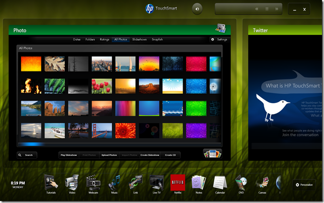
Direct interaction / tile size: The biggest change is that the top row of tiles is much bigger and wider in 3.0. This enables direct interaction with the content of the tiles, something the 2.x software didn’t allow for most tiles. This means that you can no longer scroll the top row of tiles by just touching them anywhere and then moving your finger. To scroll you have to use either the colored bar at the top of the tile or the semi-transparent border around the tile.
Resource usage: In order to let you better manage resource usage while running the TouchSmart software, tiles that are placed in the bottom row no longer present any live data as they did in 2.x. So if you find little use for all but two tiles, for example, put the ones you don’t use much in the lower row. That way only two apps have to run (each tile corresponds to an app) and the computer will have more resources available for other tasks.
Tile states: TouchSmart 3.0 still has the concept of two app states: the state a tile is in when it’s in the top row (called “wide-interactiveâ€) and the state it’s in when you “launch†it (called “largeâ€). The difference is more academic in 3.0, since you can now interact with tiles whether they’re wide-interactive or large. In 2.x you could only interact with “large†tiles. To “launch†a tile to the large state, you tap on the colored bar or the semi-transparent border around the tile. Tiles in the large state have access to more screen area, and thus may present more functionality in that state than they do in the wide-interactive state (Canvas is a good example of this.)
Speedy scrolling / “throwingâ€: One of the more fun interactions in TouchSmart 2.x was the ability to “throw†tiles, giving them momentum with a quick flick of your finger, and letting them spin until they came to rest. You could do this in the top row and the bottom row. TouchSmart 3.0 still lets you “throw†tiles, but now there is a beginning and an end to the row; things no longer just spin. That should make it a little easier to find a tile you may be looking for. Also, a “throw†will now take you to the next “set†of tiles and will always center on a tile. If you’re about to go past the end of the row, a snap-back effect will indicate that there are no more tiles in that direction. This snap-back effect is most pronounced in the lower row, since a “throw†there will take you “furtherâ€. None of the tutorial videos actually show these “throw†effects, so play around a bit to experience them for yourself. I think they’re fun, anyway.
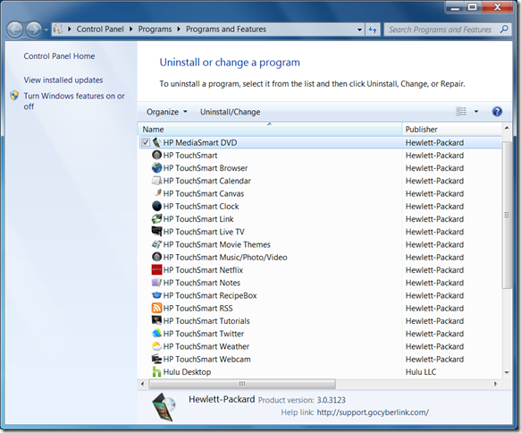
More apps, more features: TouchSmart 3.0 introduces a whole bunch of new apps: Canvas, Link, Live TV, Netflix, Recipe Box, Twitter and Hulu. You can read much more about these on the HP TouchSmart product page.
Also, the “main†apps (Music/Photo/Video) have been improved substantially, allowing for home network discovery of media files (support for USB/network/Media Server locations) as well as providing access to Pandora and Rhapsody Internet music services.
Personalization: An area that got a major overhaul in the “Shell†application (branded “HP TouchSmart†proper, but really named SmartCenter by the developers) is Personalization. The introduction of the colored bar at the top of each wide-interactive tile enabled bringing in lots more “colorâ€. Let’s take a more in-depth look at the personalization screens:
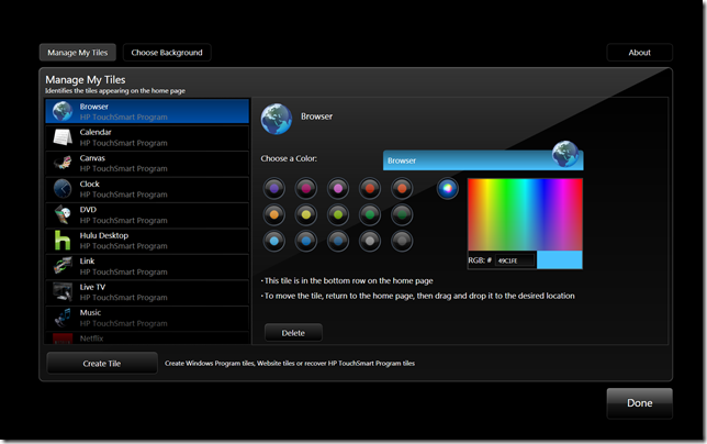
On this screen (Manage My Tiles) you can pick a tile to customize in the list on the right (hitting a letter on the keyboard takes you around the list quickly). Then you can choose a color for the tile’s bar on the left, using the various buttons or the rainbow color picker (with an optional RGB color input field for access to all colors). You can also delete a tile. If you do that, and the tile was one of the TouchSmart apps, you can get it back via the Create Tile button (pick the button called HP TouchSmart Program).
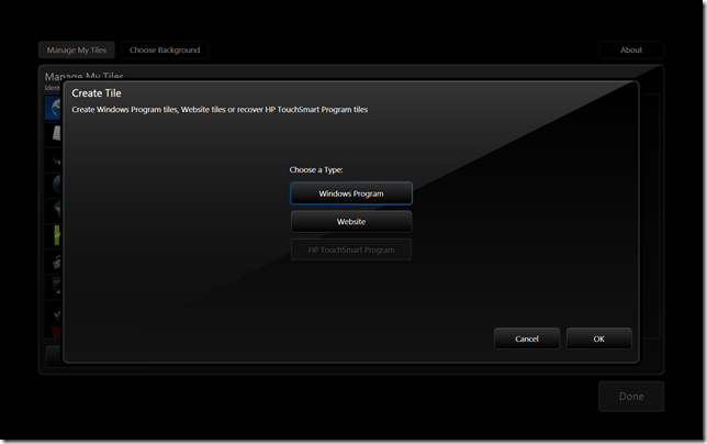
You can create a new tile using the Create Tile button:
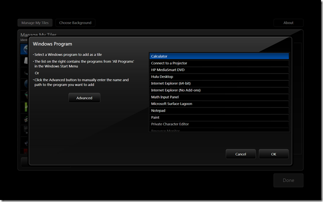
Creating a Windows Program tile looks like this:
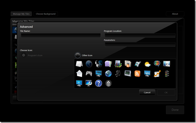
You can choose from a list of programs found on your computer (the list is filtered a bit to suppress irrelevant programs) or use the Advanced button to define everything “by handâ€:
Here you can name the tile, type in the full path to the executable (exe) and define any command line arguments in the Parameters box. You can also pick an icon (if the exe has a suitable icon you can use it, or you can pick from a list of icons provided by HP TouchSmart.) If you find the list of icons too limiting, you can place icon files of your liking (best to use 256*256 PNG files with transparency) in the folder %LocalAppData%\Hewlett-Packard\TouchSmart\SmartCenter 2.0\Icons and they should get added to the list [This is for all you fellow geeks out there.]
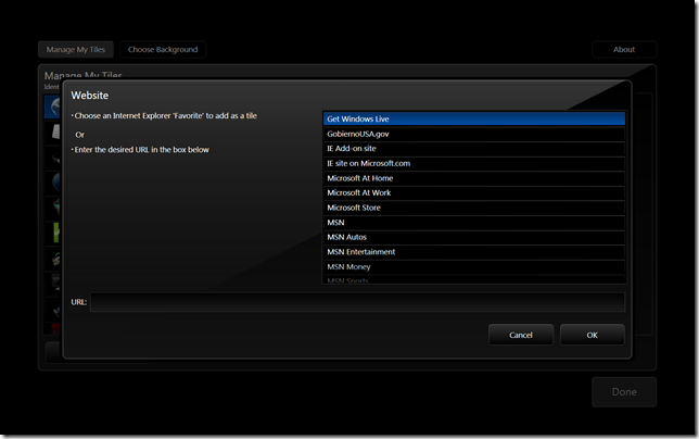
Creating a Website tile is quite similar, except here the list is made up of Favorites from Internet Explorer:
Typing in your own URL (aka website address) also works.
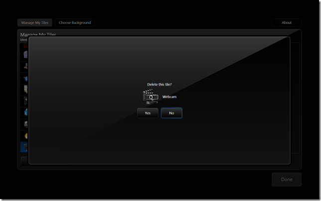
Tapping the Delete button for a tile just brings up a confirmation screen:
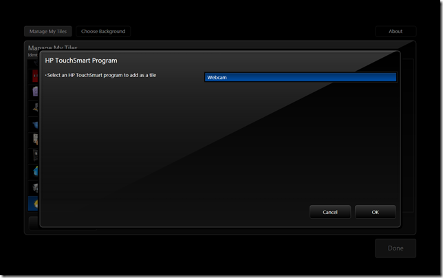
If you delete a TouchSmart Program tile, you can recover it later via the Create Tile button by choosing the HP TouchSmart Program button as mentioned above. That will look a little like this:
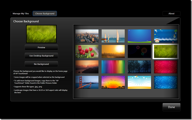
TouchSmart 3.0 comes with a lot more choices of background pictures as well. You can select one from the Choose Background screen in Personalize (see the three buttons towards the top: Manage My Tiles, Choose Background and – on the far right – About):
You may not have all of these since my screenshots are from a custom install on a test machine. To add your own background pictures to this selection screen, just copy some pictures to the “HP TouchSmart†folder in the Public Pictures folder of Windows 7. Sadly, the ones I managed to get included in 2.x are now gone 🙁
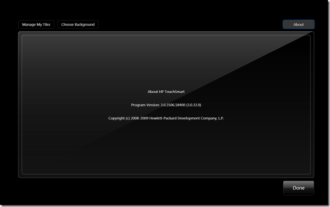
The last area of Personalize is the venerable “About†screen. Here you’ll find the version number of the SmartCenter program itself as well as a “build†number (in parentheses, here you see “build†32):
I hope you enjoyed this little guided tour around the TouchSmart 3.0 “shell†and learned something new in the process!
If you’re a developer and want to know how you can add your own apps to the 3.0 “shellâ€, stay tuned. More information on that will be coming out soon.
P.S.: Here’s a list of direct links to some more TouchSmart 3.0 tutorial videos:
General
Canvas
Demo
Recipe Box: Overview
Recipe Box: Headset
Recipe Box: Add a recipe
Recipe Box: Voice control
Recipe Box: Troubleshooting
Touch Tips
Live TV: Setup
Live TV: Watch and Record
Video: Make Videos
Steve
GeekTieGuy
Steve
GeekTieGuy
hchwa
GeekTieGuy
Len
GeekTieGuy
Riana
GeekTieGuy